
The Canucks are distinct amongst North American sports teams in that they have quite possibly the most diverse collection of logos and jerseys out of any pro team’s history. When you go to a Canucks game and look out at the crowd of fans, you see a rainbow of colours. The jerseys have gone from blue and green to red and yellow to black and maroon and then finally back to blue and green. And with the team ready to celebrate its fiftieth year in the NHL, rumours persist that the Canucks will unveil yet another set of new jerseys to mark the occasion.
While rumours and theories (and leaks) continue to swirl over what these new jerseys will look like, the Canucks have kept silent on what we can expect and when to expect it. So in the meantime, I thought it would interesting to take a step back and have a look at each logo that has been used for pro hockey in Vancouver’s history. That way we get a good idea of the context that this change is happening in, and maybe even find a clue or two about what this change will be.
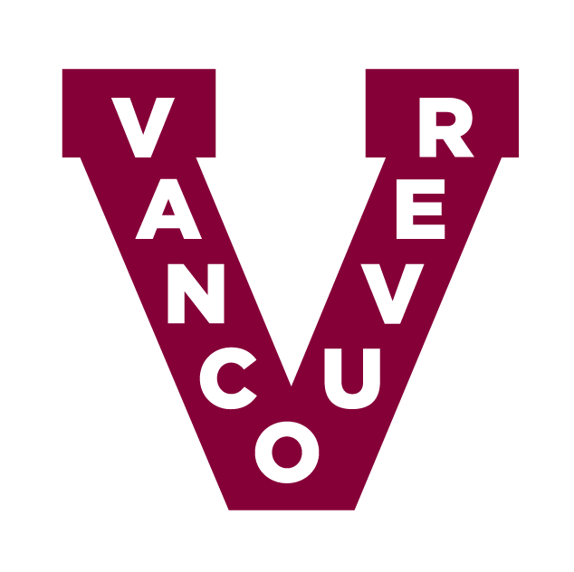
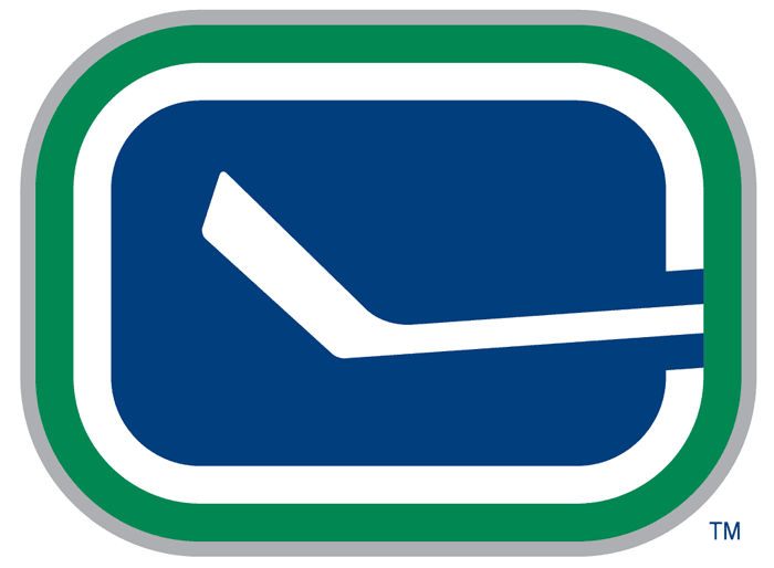
The V
1911-1926
1928-1930
1933-1941
We begin pre-Canucks, back in the wild days of early professional hockey. Vancouver’s first pro hockey team was called the Millionaires (and given the city’s current housing climate, one could argue the team name would be even more relevant today). So far, they are the only Vancouver-based team to win the Stanley Cup, which they did against the Ottawa Senators in 1915.
In 1922, the team changed their name to the Maroons, and then folded along with the Western Canada Hockey League in 1926. They were replaced by the Vancouver Lions of the Pacific Coast Hockey League, who used the same V logo. After the Lions folded in 1941 (hockey leagues folded a lot back then), the V went into disuse until the Vancouver Giants junior league team brought it back for a special game in 2008. The Canucks began to use it themselves on the occasional “heritage” night between 2012 and 2014.
I think it’s a great logo, but it looks pretty old-fashioned, so it’s probably one to bring out only for the occasional “Remember the Millionaires?” moments.
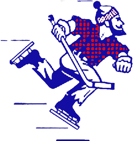
Johnny Canuck
1945-1970
Johnny Canuck, from whom the Canucks get their name, began as a political cartoon personification of Canada, much like Uncle Sam is for the United States. The character was then turned into a comic book action hero during World War II, and the original Vancouver Canucks of the Western Hockey League took advantage of his popularity and made him their team name and logo.
After the minor league team disbanded upon the arrival of the new NHL team in 1970, Johnny Canuck was retired. Despite the fact that he was the team’s namesake, the NHL Canucks did not use any kind of Johnny Canuck logo until goaltender Roberto Luongo put the old logo on his mask in 2006. After positive fan reaction to the move, the Canucks made a new logo that combined Johnny Canuck with an homage to the V and used it as a shoulder patch on their alternate jerseys.
Given that he’s literally the guy the team is named after, my hope is that the Canucks will start to feature him a bit more in the future. It’s a great logo representing a fun part of Canadian history.
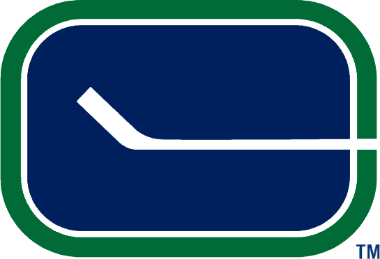
The Stick-in-Rink
1970-1978
This classic Canucks logo was the first used by the NHL team, yet it is also the least used. Despite the love many Canucks fans have for it, the Stick-in-Rink was only used as primary logo for eight years, in which the team didn’t do much of note. It re-emerged on an alternate jersey in the mid-2000s and since then has been used as both an alternate logo as well as a shoulder patch on the primary jerseys.
Like most Canucks fans, I really like the original version of this logo (although I’m not wild about the new blocky one). I would not complain if the Canucks ever decided to switch back to using this as their primary!
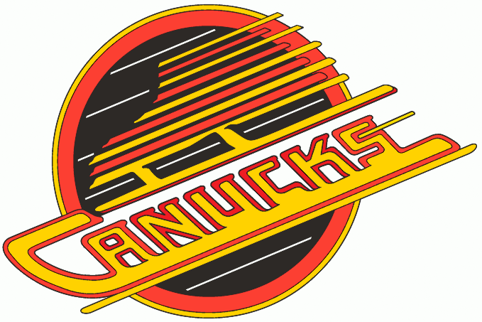
The Flying Skate
1978-1997
The Flying Skate was introduced at the same time the Canucks unveiled possibly the ugliest hockey jerseys of all time: the infamous Flying Vs (“Flying” was apparently a big buzzword for the Canucks at the time). This is the Canucks logo most old school hockey fans think of because it was the one they wore for their first two Stanley Cup runs: ‘82 and ‘94. It was retired in ‘97, but has been brought back in recent years for special games and will be used occasionally in the upcoming season to celebrate the Canucks’ 50th Anniversary.
I have fond feelings towards this logo, as I was a kid during the Trevor Linden and Pavel Bure glory years. But I think the logo looks pretty dated, and despite my love for the nostalgia, I’m glad the team ultimately went in a different direction.
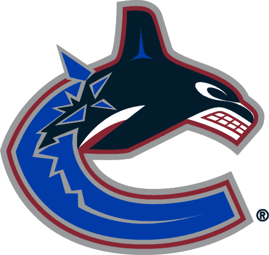

The Orca
1997-Present
The Orca is the most divisive out of all the Canucks logos. It was introduced in 1997 because the team wanted a look that better represented the West Coast. It also (and this is where the divisive part comes in) was believed to represent the new ownership group of the Canucks, Orca Bay Entertainment. Although Orca Bay sold the team over a decade ago, the logo (and the resentment) remains. Nevertheless, the Orca remains a highly-recognizable logo for the Canucks, especially after being featured during the Canucks 2011 Cup run, and it is now the longest used logo by the NHL team.
I myself really like this logo and I’m glad the Canucks have stuck with it for so long. I don’t care whether or not it has any connection to Orca Bay Entertainment. Orca Bay hasn’t existed for over ten years, so the logo isn’t advertising anything except the Canucks at this point. It’s distinctly Vancouver in a way no other team can emulate (at least until Seattle joins the league in a couple years).
The Charts
To help visualise the usage of each logo, I’ve created a few nifty charts.
Years Used as a Primary Logo
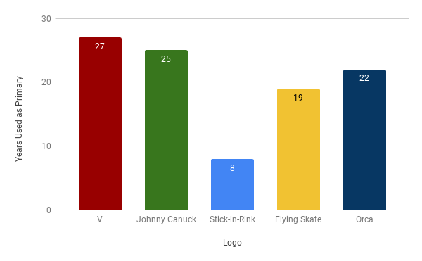
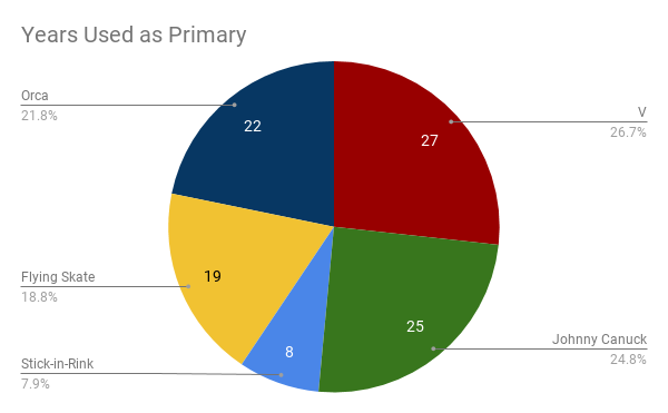
Here I’m looking at how many years a logo was used by a team as its primary logo. As you can see, the Stick-in-Rink is way below the other four. It is also surprising to see how long both the V and Johnny Canuck were used for. Even the Orca logo, which has been used the longest by the NHL franchise, needs another five years to get past Johnny Canuck and tie the V. While the NHL team has lacked consistency with its various looks and logos, the previous pro hockey teams in Vancouver clearly did not struggle with the same issue. That must’ve been nice.
Years Used Total
Of course, the primary logo isn’t the only logo we see nowadays. Most teams now have two or three logos to be featured either on other parts of the primary jersey or as the main logo for an alternate jersey. This is definitely the case with the Canucks (who have never found an old logo they didn’t like), so I also broke down the total amount of years a logo was used at all.
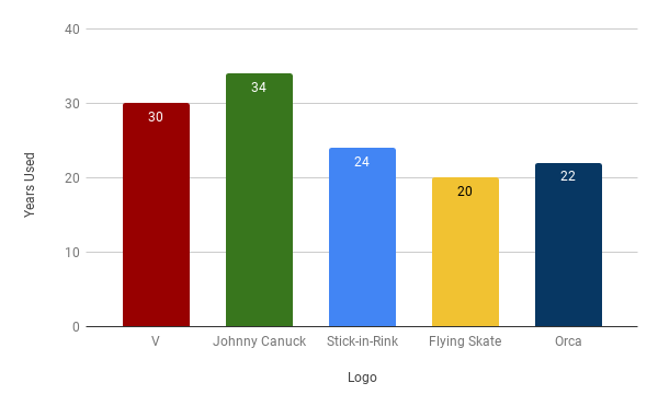
Here you can see the Stick-in-Rink gains significant ground on the others, passing both the Orca and the Flying Skate. Even though it was barely used as a primary logo, its use as both the shoulder patch on recent primary jerseys and the main logo on alternate jerseys has made this logo iconic, even for current Canucks fans.
Johnny Canuck, after being a shoulder patch for the alternate jersey, grabs the lead as the most used logo in Vancouver history. This is a bit surprising, as the NHL Canucks didn’t make use of him until the shoulder patch in 2007. It’s simply all those years used by the WHL Canucks.
The Leak
I was going to include my predictions for the upcoming jerseys, but last week the new primary home jersey potentially got leaked on Twitter and Reddit. While it’s easy for me to claim this now, the new jersey does line up with what I was going to guess. As you can see, they’ve removed the gratuitous VANCOUVER arc above the Orca logo (and not a moment too soon). They’ve also switched the Stick-in-Rink logo on the shoulders to the white version, which is how the logo was used on the original blue jerseys.
I expected that the Canucks would stick with the Orca logo, as polarising as it’s been amongst Canucks fans, because it has been such a crucial part of the look the Canucks have used for the last ten years. When you see that logo, you know exactly what team and city it represents. It’s been in use for twenty-two years now, and I approve of the Canucks choosing to continue building on a consistent look for the team, especially since that has been so lacking in the past.
Ultimately I like the new jersey. I’m glad we’re keeping the Orca with the blue and green jersey colours, I’m glad the Stick-in-Rink shoulder patches are the white versions (although I do wish they had used the original logo instead), and I’m very, very (very) glad the VANCOUVER is gone. Consider me a happy fan who will likely spend way too much money on one of these in the near future.
Prediction
While the surprise of the new primary jersey may have been spoiled, the Canucks’ new alternate jersey, however, still remains a complete mystery. I believe the Stick-in-Rink alternate, in use since 2008, will be retired. My prediction is that Canucks fans are finally getting the Johnny Canuck jersey they’ve wanted for years. The demand has been there for a long time, ever since Luongo brought him out of retirement. As shown above, it is the most-used logo out of the five, and it has a long history in this city. Yet the Canucks haven’t tapped that well quite as much as they could have yet, so I think this move is long overdue for a franchise that loves mining the past. I would not be surprised if the Johnny Canuck vignettes used during games last season were an attempt by the team to test fans’ reaction to him.
Not to hedge my bets too much, but with that said, I could also see the Canucks doing something wildly different with the alternate jersey. Because the Flying Skate jersey will be back next season as a heritage jersey for the 50th anniversary, the Canucks might think that since the nostalgia box is already ticked, they have an opportunity to be a bit more creative and make a brand new logo and jersey (like the Winnipeg Jets did last year).
For the record, I really do think we’re getting a Johnny Canuck jersey, but I’m also saying that it would make sense for the Canucks to move in a completely new direction as well.
In Conclusion
It’s nice to finish this and realize that I really do like all the logos that have graced Vancouver hockey. The V and the Flying Skate, while they may be outdated nowadays, were great for their time. The Orca is perfect for where the Canucks are at now and will hopefully continue to represent the team well into the future. And the Stick-in-Rink and Johnny Canuck are timeless classics, ready to be used again when they are needed.
While I would probably say the Stick-in-Rink is my favourite logo (I’m a sucker for nostalgia), I do think the Orca is the best so far, since it represents Vancouver well and has a look that helps the Canucks stand out from other teams. That said, if the Canucks were to bring back Johnny Canuck, I could see my opinion someday being swayed.
And that’s it for my retrospective on the crazy history of branding hockey in Vancouver. I’m not quite sure what it is about this city that has prompted its teams to abandon established logos and go off in completely different directions, but I’m glad the Canucks have settled into their current look and are potentially continuing with it into the future. Starting next year, the Canucks are going to be an old team. No, they’re not the Original Six, but they’re fifty years old. That’s a lot of hockey. While it’s fun to see decades of Vancouver history reflected in the wildly different jerseys fans wear, it would also be nice to someday go to a Canucks game and see a bit more consistency amongst the crowd. Hopefully the new Canucks jerseys (and maybe new logos!) move in that direction.
Notes
1. In regards to the charts, I did not count the Flying V as a logo, as it was a jersey design while the Flying Skate was the actual logo, even if it was on the sleeves instead of the chest.
2. Also in regards to the charts, I did not include the Johnny Canuck/V hybrid logo as a V logo, because in my opinion the V used in the hybrid doesn’t look enough like the real V.
3. And finally in regards to the charts, I did not include the year Luongo first used the Johnny Canuck logo on his mask, as that was a personal choice by him and not really an official use by the team (as far as I know).
4. The numbers might be a bit off by a year or two, particularly for the pre-NHL teams, as the records for what logos they used are hard to come by. I leaned a lot on HockeyDB.com for this.
5. All logos featured in this blog are from Chris Creamer’s amazing sports logo database: www.sportslogos.net
6. Although the leaked picture has been posted by multiple sources on Twitter and Reddit, the version I used was posted by Twitter user @silverwinger77

Who says history isn’t fun? And enlightening? And liable to prod you into expensive sweater purchases?
LikeLike